Brands
Monday 2 May 2011
Tuesday 26 April 2011
Monday 25 April 2011
Evaluation
So far i'm generally happy with the progress I've made so far with regards to creating an identity for the new building's foyer and a interesting way finding concept. More or less, from the very beginning I had my mind set on a very simple, modern, minimalistic look, which would hopefully create a nice chilled place but would also offer students a good, functional working space. At this point in time, to put across and store my initial ideas I've done some research surrounding brands, The Brit School, and inspirational architecture and artists. However, one of my targets will be to step up the reseach I do and really work on making it more in depth and linking the reseach to my own work and ideas. Aswell as research, I have currently done a few sketches of my design concepts, which I do believe work well and show that my idea has some potential. To improve upon these sketches I plan to do more and to also do some designs digitally in order to make them look that little bit more professional. I think that a really worth while part of this project was carrying out a questionnaire which Brit school students were asked to answer about their thoughts and feelings towards the Brit School. It proved worth while as it's key to know what the students as a whole want from the new building as really the students are who the building is for and so it needs to appeal to them. From doing this project I've learnt that it's important when designing interiors for buildings like this one that everything is functional, but you can also think outside of the box a little bit as it's meant to be unique, vibrant, exciting and new. I have really enjoyed this design project as it really is offering us all a great opportunity, as it allows us a chance of putting our print on a Brit School building. It would be amazing to think that we've left a little reminder of ourselves at the Brit School that will remain there for many years to come.
Inspiration
Donald Judd
Donald Judd is widely regarded as one of the most important artists of the twentieth century. Judd (1928–1994) worked across art, furniture and architecture. Judd became known as one of the key exponents of ‘Minimalism’, but it was a label that he strongly rejected. Although he shared many of the principles identified with Minimalist art — the use of industrial materials to create abstract works that emphasise the purity of colour, form, space and materials — he preferred to describe his own work as ‘the simple expression of complex thought’. Having begun his career as a writer and critic, Judd’s theoretical texts on art and exhibition practice remain strongly relevant, as do his furniture designs which are still manufactured today and continue to resonate in contemporary
design practice.


design practice.
The configuration and scale of art cannot be transposed into furniture and architecture. The intent of art is different from that of the latter, which must be functional. If a chair or a building is not functional, if it appears to be only art, it is ridiculous … Furniture is furniture and is only art in that architecture, ceramics, textiles and many things are art.
Donald Judd, It’s hard to find a good lamp, 1993
Donald Judd, It’s hard to find a good lamp, 1993
Judd broke new ground in his exploration of volume, interval, space and colour . He rejected the tradition of artistic expression and craftsmanship by using industrial materials such as Plexiglas, sheet metal and plywood, and from the mid-1960s his works were fabricated by external manufacturers. By encouraging concentration on the volume and presence of the structure and the space around it, Judd’s work draws particular attention to the relationship between the object, the viewer, and its environment. This relationship became a central focus of Judd’s career, and he devoted much of his later life to the sympathetic installation of his own work.
Some of Donald Judd's work :


Viagrafik
The art- and designcollective Via Grafik, based in Wiesbaden, Germany, was found in 1998 as a crew of graffiti- and streetartists. The wide range of works of the six members SIGN, BOE , G13, N6, MNWR KS and Lars Herzig goes from Wallpainting to Logo- and Corporate Design, Illustration, 3D-Sculptures and Interior Design to Motiondesign and Photography.The crew got to be known for inventing graphical methods to graffiti and since 2002 after having been invited to the Urban Discipline Exhibition in Hamburg, BOE and MNWR KS decided to offer professional design services under the name of Via Grafik as well. The studio attracted attention in the designscene for its incisive style and the great diversity of their work. Via Grafik got invited to take part in a large number of exhibitions and publications (i.e. A rt of Rebellion, Fadings, Backspin, Juice, Blond, Defrag, various books at Die Gestalten Verlag,...) and they realized commissons for global brands like Nike, Nintendo, Adidas, Volkswagen or Staatstheater Wiesbaden as well as for smaller companies based in their area.Some of Viagrafik's work :


Friday 15 April 2011
Aedas
Aedas

Aedas, a leading international design practice, offers services in architecture, interior design, master planning, landscape, urban design and building consultancy within Asia, the Middle East, Europe and the Americas.
They are committed to their core value of design excellence and are dedicated to research & development and sustainability.
Their unique framework allows them to apply international expertise in local economies, supporting the communities in which they work.
They are committed to their core value of design excellence and are dedicated to research & development and sustainability.
Their unique framework allows them to apply international expertise in local economies, supporting the communities in which they work.

- The theatre will be around 2 and a half levels high and will not have any windows.
- The bottom level of old building will be made up of glass panels.
- The connecting part of the two buildings will be glass.
- It is all about functionality.
Our task is to come up with way finding ideas to be placed around the building and to think about interior design for the foyer space.
What do we mean when we talk about branding ?
- Function
- Creating an identity
What does it involve and why is it so important ?
- Advertisement
- Identity
- Colour
- Logo
- Typography
Logo Reworking
Brit school logo can be adjusted but not completely as it still needs to be easily recognized.
The Brit School Logo

- Looks dated
- Horrible orange and blue colour scheme
My Questionnaire
How does the nature of the interior of a building effect us ?
- Changes moods
- Colour therapy
- Happy, sad, excited
- Warm colours make you happy
- Shape
- Structure
- Lighting - natural light
- Physical space
What is Way finding ?
- A way you find your way around a place
- Saves time
- Saves stress
How can we tie this to our rebranding?
- Recognition
- Really clear and obvious
- Creative
- A key could be used
History of Starbuck's logo

Interview with Bojan Stefanovic
Bojan Stefanovic aka Logoholik, is a logo and brand identity designer from Serbia and has bags of experience in the field. He’s kindly agreed to take part in an interview on Brand design blog so we all might benefit from what he’s learnt along the way.
http://blog.brand-design.co.uk/2010/interview-with-bojan-stefanovic/
Unilever
Unilever products touch the lives of over 2 billion people every day – whether that's through feeling great because they've got shiny hair and a brilliant smile, keeping their homes fresh and clean, or by enjoying a great cup of tea, satisfying meal or healthy snack.
South London Gallery
- Bold
- Subtle
- Sophisticated

http://www.dezeen.com/2010/06/23/south-london-gallery-extension-by-6a-architects/
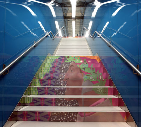
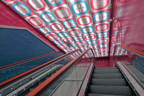
University of Naples Metro Station


http://www.dezeen.com/2011/04/01/university-of-naples-metro-station-by-karim-rashid/
Churchill Museum
- Simple
- Large panels
- Etching onto glass

Festival of Ideas, Downtown Manhattan


Monday 4 April 2011
Branding and Architectural spaces
Brand Identity
The definition of brand identity is the visible elements of a brand, such as colours, design, logotype, name, symbol that together identify and distinguish the brand in the consumers' mind.
Example 1 - Coca Cola

I believe this is an extremely strong example of brand identity as it's a logo that can be easily recognised world-wide. Simplicity is the key with this logo as it's not over complicated and sticks in the consumers' minds. With the logo only being made up of two main colours it makes the visual more bold and striking, the white typography immediately grabs your attention. The typography also has a very 1920's look about it which shows it hasn't changed too drastically over the years and the brand has remained proud and stayed true to it's roots. For me, the bright red used in the logo could simply be used to represent love. This is such a sucessful logo that it doesn't even need any imagery of the product, as soon as you see it you just know it's the logo for the coca cola drink as it's such a well known and trusted brand.
Example 2 - Nike

This second brand logo is also extremely sucessful in that it is also easily recognisable world-wide. This is a really simple logo that doesn't even need the brand name to accompany it in order for consumers to know what it is. The tick is extremely easy to recognise as it's such a unique logo. It seems so far that the more simple, uncomplicated logos seem to be the most sucessful in that they are more likely to stick in the consumers' minds. The tick doesn't even need to be in a bright colour as the tick alone is bold and striking enough. As soon as a consumer sees the Nike logo on a product they feel they can trust the product as the Nike brand is highly respected as it's grown to gain a very good reputation.
Example 3 - Converse
This brand logo has a bit more to it than the other two logos previously looked at, however I personally think it's just as sucessful. Like with the Coca Cola logo, Converse has stayed true to it's roots with the original logo from when they first started out. The use of blue, red and white is used in this logo as they are the colours of the American flag, and Converse originated from America. The first thing you notice when looking at this logo is the huge star in the middle of it, which grabs the consumers' attention and makes them feel that they too could be stars if they wear the Converse brand. The Chuck Taylor signature makes the logo more personal and shows originality.
Architectural Spaces
Pompidou Centre, Paris

The Pompidou Centre was thought up by President Georges Pompidou who wanted to create an original cultural institution in the heart of Paris completely focused on modern and contemporary creation, where the visual arts would rub shoulders with theatre, music, cinema, literature and the spoken word. Housed in the centre of Paris in a building designed by Renzo Piano and Richard Rogers, whose architecture symbolises the spirit of the 20th century, the Centre Pompidou first opened its doors to the public in 1977.
The Tate Modern
The Tate Modern

Tate Modern was created in the year 2000 to display the national collection of international modern art (defined as art since 1900). By about 1990 it was clear that the Tate Collection had hugely outgrown the original Tate Gallery on Millbank. It was decided to create a new gallery in London to display the international modern component of the Tate Collection. For the first time London would have a dedicated museum of modern art. At the same time, the Tate building on Millbank would neatly revert to its original intended function as the national gallery of British art.
An immediate problem was whether the modern art gallery should be a new building or a conversion of an existing building, if a suitable one could be found. As a result of extensive consultations, particularly with artists, it was decided to search for a building to convert. When the building that is now Tate Modern presented itself, it appeared something of a miracle. It was a former power station that had closed in 1982, so it was available. It was a very striking and distinguished building in its own right, by the architect Sir Giles Gilbert Scott. Not least, it was in an amazing location on the south bank of the River Thames opposite St Paul's Cathedral and the City of London. Plans were almost immediately formulated to build a footbridge to link the new gallery to the City. The fact that the original Tate Gallery was also on the river made a satisfactory symmetry, and meant that the two could be linked by a riverboat service.
An international architectural competition was held attracting entries from practices all over the world. The final choice was Herzog and De Meuron, a relatively small and then little known Swiss firm. A key factor in this choice was that their proposal retained much of the essential character of the building. One of the shortlisted architects had, for example, proposed demolishing the splendid ninety-nine metre high chimney, a central feature of the building.
The power station consisted of a huge turbine hall, thirty-five metres high and 152 metres long, with, parallel to it, the boiler house. The turbine hall became a dramatic entrance area, with ramped access, as well as a display space for very large sculptural projects. The boiler house became the galleries. These are on three levels running the full length of the building. The galleries are disposed in separate but linked blocks, known as suites, on either side of the central escalators. The Tate collection of modern art is displayed on two of the gallery floors, the third is devoted to temporary exhibitions. Above the original roofline of the power station Herzog and De Meuron added a two-storey glass penthouse, known as the lightbeam. The top level of this houses a café-restaurant with stunning views of the river and the City, and the lower a members room with terraces on both sides of the building, the river side one offering the same stunning views as the restaurant. The chimney was capped by a coloured light feature designed by the artist Michael Craig-Martin, known as the Swiss Light. At night, the penthouse lightbeam and the Swiss Light mark the presence of Tate Modern for many miles.
Subscribe to:
Posts (Atom)


